With the information gathered from the consultation sessions firmly in place, it was now time to start researching – a process that would hopefully spark ideas for the artwork.
I needed to really get a feel for Bridlington’s seafront – it’s beauty, it’s life, it’s energy and it’s people. My aim is to create artwork that of course can be appreciated for it’s aesthetic beauty, but very importantly has relevance and means something to the people that will see it, perhaps every day. So I set off, camera and sketchbook in hand, to explore the Promenade, the harbour and Bridlington in general.
At this point I had a completely open mind regarding what the artwork would actually be. Although I had already decided I wanted the artwork to reflect the land and seascape surrounding it and to bounce light around, and I knew from the consultations that text could well feature strongly, I didn’t know what imagery the artwork would actually contain. I knew I wanted to come up with something that would be a harmonious part of the environment, so looking at that environment in a very detailed way seemed a good place to start.
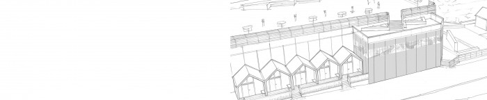
The geometry was the first thing that hit me, strong stripes and grids within the architecture of the Headworks building itself. The sunlight created wonderful abstract patterns, which slid across the building and changed shape as they went.
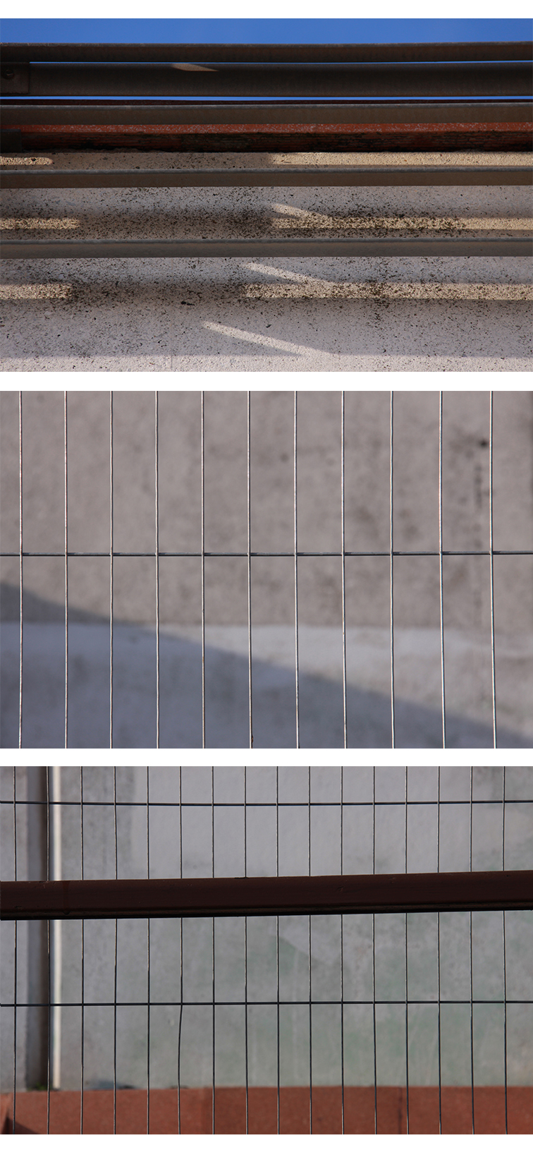
The Promenade and the beach were inspiring for their pattern and geometry too…

